I am going to run with Dion’s frustrating user experiences, or what I like to alternatively call “grinds my gears” care of Peter Griffin.
At any rate, like all good Canucks I have spent many hours wandering the isles of my local Canadian Tire store looking for a hammer, cooler, fishing rod, car part, or hockey stick. In general the in store experience of Canadian is a nice one that brings back memories of childhood for many. Canadian Tire stores from my experience (aside from the new Wal-Martesque mega stores) are notoriously dirty and unorganized and when you finally make your purchases you always get your Canadian Tire money that goes into the car glove compartment never to be seen again.
Meanwhile the Canadian Tire website experience starts something like the image below…
The first thing that they want to know is your postal code. WTF! I just want to buy something, take my Canadian Tire money, and leave. I definitely do not want to engage in a relationship beyond that with you Canadian Tire and yet just to browse your products I have to enter my postal code.
Now I know that Canadians tend to be pushovers (though not always) but I can’t help wonder how much more money Canadian Tire would make if they did not require people to enter their postal code just to browse. If anyone reading knows someone with any pull at Canadian Tire online please put me in touch because I want to buy a solar panel from them!
Posted in Web, usability | 4 Comments » | Add to Delicious | Digg It
As a break from working on the imminent Complete UI release I decided to do my taxes tonight and rant.
I am seriously fed up with ye’ old Future Shop and their ordering process. I have commented on their broken search before which has generally proved to be completely useless. Not to mention their terrible product taxonomy - I mean who would look for a computer mouse in Home / Computer Add-ons vs Home / Computer Accessories! What the heck is a “Computer Add-on” anyways?
Now I did eventually find something that I wanted from Future Shop, some nice new monitors for a few people at Nitobi who don’t have monitors for whatever reason (myself included). I checked out with little pain aside from the constant logging me out.
The next hurdle was the email that they sent me pretty much immediately saying that they needed to verify the order and were going to get in touch with me and that I was to call them. That left me sitting there scratching my head thinking am I to get in touch with them or are they calling me since they said both in their email, and I certainly didn’t want my order to be canceled if we didn’t talk within five days as they threatened! So i searched for a customer service number - which I would have though might be in their email they sent me but of course was not - and called them after finding a general number. The phone system I was connected to insisted on hanging up on me several times, after I had already navigated several levels deep thoughtfully considering which option from each menu would be most appropriate. Throwing my hands in the air along with a few expletives I gave up for the moment.
Two days later (three days after I had ordered by this time) I got another email saying that I should call them on some 1 800 number. I have already gone onto their website to order the damn products and now I need to call them to verify something. So I give in and call. Once again I am connected to a phone system with the same bilingual automated phone agent - let’s call her Shelly - who sounds like she really, genuinely wants to help me. However, our interaction quickly goes south. Was it something I said? This time rather than the call just being dropped I accidentally entered the wrong order number. Long story short Shelly gets pissed and tells me “You seem to be having problems using the phone system” - as though I am a complete idiot for ever entering a wrong number - “please call back later and try again” - yes she is right I think to myself, I was just so sure and head strong about actually getting the products I ordered that I couldn’t hit the correct keys and should probably take a timeout to think about what I have done and try again once I have simma’d down a bit.
After pouring myself a scotch to settle my nerves I give it a second try. Shelly answers again and this time I am very careful at entering my correct order number for fear of having my ego shattered once more and successfully enter my order number. Rejoice! Surely that should cinch the deal you are thinking now. How wrong you are my friends. Shelly then proceeds to ask me if my phone number is something prefixed with 44 … clearly living in BC I probably don’t have a UK phone number. So I politely tell her that is not my number and am prompted to enter my phone number - the very same phone number that I entered in my billing information when I checked out. At which point, as directed by Shelly, I hang up the phone and Shelly promptly calls me back asking me if I have really made this purchase. I press 1 and she says my order has been released for shipping.
That entire process was unnecessarily complicated, error prone and completely ridiculous. What is the point of making me call some number and tell them the number that I want them to call me back on to verify the purchase? How does that verify anything other than the fact that I have access to a phone that I know the number of? They already knew my number since I entered it when I checked out so why didn’t they just call me on that as soon as possible after I made my purchase?
Future Shop should really hire us to help them out.
Posted in AJAX, futureshop, usability | 1 Comment » | Add to Delicious | Digg It
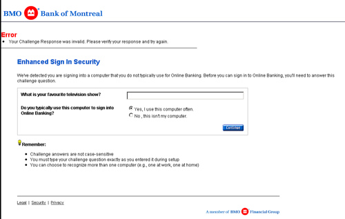
Recently when I tried to log in to my online bank account I was asked the following security question to validate my identity: “What is your favourite television show?”.
Of course normally I would answer Dallas in an heartbeat, however, I have been watching the Designing Women marathon this week and I am re-living the early romance I had with it.
Needless to say who comes up with temporal security questions? My favourite X changes from week to week so just stick to things that don’t change like your first car, first high school, first wife etc.
Posted in grindsmygears, usability | 4 Comments » | Add to Delicious | Digg It
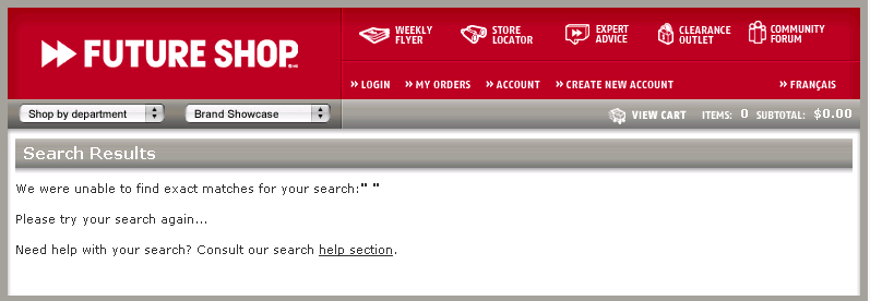
FutureShop has a great search feature. When you enter a search string that has no results they helpfully suggest you try searching again, however, they don’t present a search box nor even a link to get back to the search page. Maybe the search functionality on their site is server intensive and so want to prevent the low IQ crowd from entering too many difficult searches?
Posted in AJAX, usability | 3 Comments » | Add to Delicious | Digg It