I’ve moved my blog over to http://ambiguiti.es from now on. Over there I’ll be talking about web and mobile development, and maintain a more general blog relating to events, conferences, job postings, and other such news in the industry.
Posted in .net, Dell, agile, air, ajax, analytics, apple, as3, asp.net, basic, branding, business, coldfusion, components, conference, culture, documentation, enterpriseajax, events, firefox, flash, flex, graphic design, iphone, media, microsoft | No Comments » | Add to Delicious | Digg It
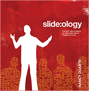 The other day, this book ended up on Andre’s desk from O’Reilly: slide:ology – The Art and Science of Creating Great Presentations. This book is less science and more art, but it’s full of inspiration and practical advice for people giving presentations. As someone who has seen a few talks, good and bad, a lot of this book rings true. In fact I think a lot of Nancy Duarte’s philosophy is similar to Edward Tufte, who is also a great presenter in his own right and a philosopher of the art of presenting – except maybe for the idea the Powerpoint is a tool to be tamed rather than one to be left out entirely.
Pick up a copy here.
Posted in business, conference, documentation, graphic design, resources, review | No Comments » | Add to Delicious | Digg It
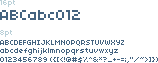
All you designers out there.. if you ever were looking for a font that was clear even at very small PT’s, this is for you. Over at WebSiteTips.com, I found a list of pixel fonts – many of them free! Check them out:
http://websitetips.com/fonts/pixel/#pixelfonts
Posted in User Interface, graphic design | No Comments » | Add to Delicious | Digg It
I know this is old.. but I just found it, and it’s hilarious. Whoever does these things is a genius
Posted in business, graphic design | 2 Comments » | Add to Delicious | Digg It
The people at NetLifeResearch have put together a funny little ‘Bad Usability Calendar’ which is an interesting look at some bad habits in interaction design. I’ve reposted it here (bad_usability_calendar_08_us_english.pdf) for download but you can also get it off their site here (http://www.badusability.com/).
Some highlights:
- Only add personalization where it adds value
- Dont require login where it isn’t needed
- Bigger is better (at least easier to click)
Posted in User Interface, documentation, graphic design, media, web2.0 | 2 Comments » | Add to Delicious | Digg It
Often times, I want to take a screenshot of a website that I either really like or really hate. Of course there are ways to do this in your OS – with some keystroke, then opening the file in photoshop or something for editing.. but there is an easier way.
Fireshot! This is a great little plugin for Firefox that lets you take an image of the ENTIRE page (even if its really long) or just the visible area. You can automatically save it to a certain folder or open it up quickly in the lightweight editor to add captions or black out personal details if necessary.
Anyway, if you are an admirer of design and want to capture things you see online for inspiration later, try Fireshot.
Posted in firefox, graphic design, resources | 2 Comments » | Add to Delicious | Digg It
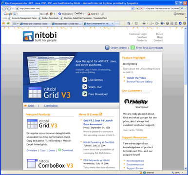 Finally! We’ve launched Nitobi.com.. This is step 2/4 in our rebranding transition and we’re proud of the new site and what it offers to users in terms of information search, usability, and so-on. Some of the neat new features we’ve implemented are:
- Feature highlights
- Product tours
- RSS feeds for everything (news, knowledgebase, forums, etc)
Coming soon are our new forums and updated branding with our upcoming product point releases (grid 3.2 and combo 3.5) this month. Step 4 is a yet unnounced expansion to our product line.. more on this soon!
�
Posted in Uncategorized, business, graphic design | 3 Comments » | Add to Delicious | Digg It
Just arrived at BarCamp Toronto (TorCamp).. it’s a great open warehouse-type space with lots of opportunities to kindof drift easily from discussion to discussion.
Listening to Albert Lai from Bubbleshare. He’s chatting about Designing for Novice Users. By the way, didn’t know this, but Bubbleshare is Canadian. They compete directly with Flickr and other photo sharing services like iPhoto and Picasa.
Removing barriers to using servces.
- RSS is a hard concept for non geeks to understand
- Albert’s mom is a Skyper!!
- Photosharing is not about photo sharing.. its about story telling
Barriers to Web Services:
#1 – Registration
– why? You dont really need this to have an identity
#2 – Bandwidth
#3 – User expectations
Bubbleshare inspired by
- Craigslist – Simple, no signup
- Picasa
- Flash
- Desktop apps
Know your audience! Bubbleshare has very clear targeting for non-geeks.. Dont solve every problem.. really focus in on what these people need. Consequently it may not appeal as much to geeks.
Example.. Choosing to build caption bubbles instead of tags. Targeting, and marketing focus.
User 14pt text on your website to increase sales!! (Thanks Dave from Voices.com)
Why did MySpaces succeed and Friendster Failed?
- Personalization – Myspaces enabled it and embraced it
The Desktop Desktop
Oops.. running out of battery!
Posted in User Interface, ajax, events, graphic design | 1 Comment » | Add to Delicious | Digg It
Working with vector and raster graphics with John from nuuvo.com. Good overview of selecting file formats for different media. Some good basic info for people who are more development oriented and not graphically inclined. I know at EBA we use a term called “Engineer Design” (cred: Joel).. which is usually the starting point for a UI or component. Then the software is handed over to someone with an artistic slant to add the polish. Its essential, though, for engineers to understand the mechanics of graphics and design so that we do not back ourselves into a technical corner.
Subtractive Color Theory – cyan, magenta, and yellow colors on paper subtracts white
light components. white light is made up of red, green and blue light, the colors subtract out that particular portion or color of light. Whatever is left is recognized by the eye as a particular color. HOW YOUR PRINTER WORKS
Additive Color Theory – Red, Green and Blue thingy. Adding these three primary colors of light,
red, green, and blue, together get white. When
any two of the primary colors are added together they make the secondary colors:
Cyan, Magenta and Yellow. WHAT VGA uses
Raster Image Formats: GIF, PNG, JPG
- Do not scale easily
- Good for Web Media
- Photos are stored this way
Vector Image Formats: WMF, AI, EPS, PDF
- Images are defined mathematically
- Better for print media and reusable media
- Do not render well in the browser
- Are interpreted at display time
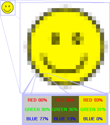
Example: Raster Image
Fonts:
- Good example of vector gfx
- Myriad is most popular for corporate identity
- Popular Serif Fonts: Times, Garamond, Bookman, Caslon
- Popular Sans Serif Fotns: Helvetica, Arial, Formata, Myriad, Frutiger
Posted in graphic design | No Comments » | Add to Delicious | Digg It