Update: I’ve posted two demos of Fisheye in action.
I thought it might be a good idea to document the development of one of our components from a user-interface perspective. We’re in the process of developing a host of new components now, which should be ready for release early this spring. One of these is a Fisheye Menu.
If you would like to see a video summary of the various stages of developing in Fisheye, click the play button below. You can also download a Quicktime version here [90mb].
Get the Flash Player to see this player.
A Fisheye menu is specifically designed to support browsing through long lists of menu items. The Mac OS X Dock is a popular example of a fisheye menu, but they have been studied in HCI circles for years. The University of Maryland Human Computer Interaction Lab found that users liked Fisheye’s for long lists in both goal-directed (I need to find x, where is it?) and browsing (I’m looking for something like x, but I’m not sure what..) tasks, but there was a lot more variance in users preference for Fisheye’s over hierarchical menus (for example).. I guess this means that some people LOVED them and some hated them. Part of the issue could be training, but with the increasing popularity of MacOS X, maybe users are getting used to the idea. They certainly present some advantages over regular menus:
- You can keep a lot of menu items in view, while allowing the user to focus in on just a few at a time.
- You don’t need to ‘hide’ menu items in order to faciliate browsing a very large list.
- They require less mouse dexterity on the part of the user than Hierarchical menus.
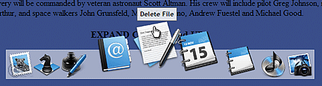
 What we actually built was a Fisheye toolbar (much like the MacOS dock), because it uses transparent PNG’s instead of text menu items. It’s a logical replacement for a regular toolbar, especially if you want to add some zing, or you in fact have lots of menu items. The development can be broken down into 4 iterations representing seperate and unique sets of UI challenges.
Iteration 1 – Proximity Detection and Scaling
First of all, I made sure Fisheye used 32-bit transparent PNG’s instead of GIF’s or JPG’s. Why? When the icons are scaled and overlap with the content below, effects like opacity and drop-shadows help the images stand out over top the content below. Also, in IE we get a nice anti-aliased scaling effect on PNG’s. In Firefox, Opera, and Safari it looks good too, but the scaling is a bit more pixelated.
Next, I wired up a simple zooming effect to the distance from the mouse to the center of each icon. One of the issues I had right away was how to calculate the correct icon size based on this distance. It turns out its not correct to encorporate both axes in this calculation. If you do, the space occupied by the ‘zoomed’ icons varies too much, and the peripherie moves around too much too. You actually want as little variance as possible in the space occupied by the enlarged icons, despite the fact that at first it may look cool.
Iteration 2 – X-Axis “Zooming”
As the icons scale up based on the proxmity to the mouse, they occupy more space, so the surrounding icons need to move out of the way. Based on the increased space taken by the zoomed icons, we move the next icons out by that amount.
 Unfortunately, an issue that cropped up was how to divy up the “extra space”. It turns out that when you have a menu aligned to the left, the icons need to be pushed out to the right.. by definition the enlarged icons themselves begin to move to the right of your focus position (where the mouse is).. So we have to constantly be adjusting for where the mouse appears to be rather than where it is measured to be. This is how you do a right, or left-aligned fisheye. It’s harder. When it’s centered you just spread the surplus around evenly. The bottom line is that the mouse must always be over the peak in the zoom.. this is probably why the ‘best’ alignment for a fisheye menu is centered in the middle (like the Mac OS Dock).
Iteration 3 – Alignments Left, Right, and Center
If the menu is aligned to the left, the extra space needs to be allocated to the right, and vise versa is aligned to the right. In a center alignment, the surplus space needs to be evenly distributed to the left and right. In the 3rd iteration I got this working pretty well.
Something else I got working in the 3rd iteration is having the items zoom up or down. If a Fisheye is positioned near the top of the page, the developer will probably want the items to move down instead of up. This was a simple addition.
Iteration 4 – Labels and Menu Item Activation (Bouncing)
 Toolbars need to have tooltips. Otherwise, the purpose of each menu item isn’t easily understood. Another purpose of labels in the case of Fisheye is for alerting the user as to which item is currently in ‘focus’. So, the next thing I did was write a simple label behaviour. If label text is available, it will appear above the menu item when it is the focal-point of the zoom.
Another requirement was to alert the user that they had in fact clicked on an object. In a traditional toolbar that uses images superimposed onto buttons, a button ‘depressed’ state shows the user a selection has been made (or is about to be made). In a fisheye (which doesn’t use buttons per-se) we need to do something else. In keeping with the MacOS tradition, I implemented a sinusoidal animation for a few seconds after the click. This animation can also be activated programmatically if the developer wants to alert the user to click on a particular menu item at any point in the application.
Iteration 5 – Container Object and Y-axis Zooming
The last iteration was for adding some of the finishing touches. The only things left for a basic Fisheye were an optional container object (in the screenshot it’s the semi-transparent background the icons are sitting on), and y-axis zooming on the icons themselves. If the menu is zooming ‘up’ then the icons should lift slightly off the container in addition to scaling. If the menu is zooming ‘down’, the icons should drop down slightly towards the focal-point.
Conclusion
It’s going to be neat to do more components like Fisheye, and start getting feedback from our users. Are people into less conventional UI components like Fisheye, or are they strictly eye-candy with no practical role in enterprise software?
I know there are still things that Fisheye can use in the way of functionality. It would be nice, for example, to have vertical orientations for the menus, and also to be able to attach traditional drop-down menus to each element. I would also like to see context menus and groupings.
If you’re looking to try a demo of Fisheye or download your own copy, you’ll have to wait a few weeks for the first version of the Nitobi suite – which will be available mid February.
 Welcome to the age of you. It’s official.