Skip to Navigation | Skip to Content


Archive for the 'User Experience Design' Category

Prototyping: Fidelity & Timing | November 12th, 2009

One of the unexpected but incredibly valuable discussions that came out of the “protoFarm” workshop we put on a few months bask was the debate about decisions about prototype fidelity. My take on it, as I stated in my earlier post about lightweight prototyping is….. it depends. You should be asking yourself that question while keeping several things in mind:

Define your goals

Where are you at in the project cycle? Delivering wireframes, testing the UI, conveying transitions, etc? Whatever the goal is, the point is to think about what you need to convey to the client or to your dev team and focus on the best solution for the milestone in front of you.

But…. what tool? There’s so many to choose from

I tend to use clickable prototypes built in Adobe InDesign for expediting wireframe review and providing developers with and interactive design spec. There’s a slew of other options including HTML, Flash, Axure, iRise, Fireworks, OmniGraffle and wait for it……good ol’ pen & paper.

Do you need a platform that generates specifications from the prototype and provides built-in collaboration? If so, then perhaps Axure is the tool for you.

If you don’t need those integrated features, then you can look at thinner solutions like InDesign, Fireworks or OmniGraffle.

If you’re kicking off a project then nothing works better than pen, paper and a healthy supply of your favorite caffeinated beverage.

Regardless of the tools I’ve listed and missed, the point is that you should set a goal for yourself to understand your project and client well enough that you have a good feel for, at a baseline:

A) Context
B) Your skill set
C) Budget
D) Client Type

Clearly, there’s a ton of things to consider in this discussion. What goes through your mind after reading this?

Posted in Interaction design, Prototyping, User Experience Design | No Comments » | Add to Delicious | Digg It

Designing a 46″ Touchscreen Application for the Vancouver Aquarium | October 14th, 2009

Starting back on August 20th we kicked off our first touchscreen project here @Nitobi. In this post it seemed to make sense to break this up by the Process we employed and the Insights gained along the way, with some supporting Assets dabbled in for good measure.

So, in the name of Process here goes…

1. Paper Prototyping Workshop

It’s hard to put into words how excited I was to dig into this project and there was certainly a buzz around the office anticipating it’s start. Being my first touchscreen project my mind immediately started thinking “cool! now, where to start?”. Knowing the scale of the application it only made sense to me that we dive headlong into a paper prototyping workshop to get the juices flowing and have everyone involved from the beginning. That said, I put together a 3-4hr Paper Prototyping workshop with our client Jeff Heywood, Yohei (Nitobi Interaction Developer) and myself. The application is a commenting system for Aquarium visitors to ask questions or make comments about the Arctic and respond to existing questions/comments.

Supplies for the workshop included: 3×5 index cards, sharpies of many color, post-it notes, 5×8 index cards, scissors, MARS Drafting Dots, a roll of butcher paper, some simple pens for sketching and a fresh helping of warm caffeinated beverages.

I covered our boardroom table with white butcher paper so we could all embrace our inner child, drawing outside the lines w/o repercussion, and I also cut out a handful of full size versions of the 46″ monitor and taped them to the walls. After describing the context of the design challenge we were to consider I passed out (6) 3.5 index cards to everyone and set the timer to 60sec. The importance of this exercise is to essentially force us out of our comfort zone of pre-conceived design patterns that spring to mind and get to storming up some new ones. As I’ve observed in the 2 times experiencing this process, ideas 3-5 tend to be very interesting as that seems to be a regular point where our minds often run out of easy answers and start coming up with new ideas. NOTE: I can’t overstate the importance of communicating that it’s the process that’s more important than coming up with genius ideas. Everyone is equal in the workshop and there are no “wrong” ideas, just ones that are more appropriate than others given the constraints of the project.

6minutes = 6 Sketches
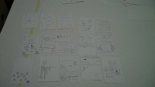
So here we go! Off and running with one sketch per minute. Love it. Remember… no wrong ideas, just sketch something! As I expected, we all came to a natural sticking point at rounds 3-4. No matter. Once we finished the 6 minute exercise we went around the room briefly explaining the meaning of each sketch with the opportunity for fellow participants to comment and/or ask questions. For cards that stirred up decent discussion I asked everyone to flip the card over and note a theme or some key words that emerged from the feedback.

paper_prototyping_indexcards


Go Big!
We’re about 1hr in at this point after discussing all 6 rounds of cards (18 cards) and it was time for everyone to pick their concept that they wanted to GO BIG with on the full size interface prototype! Without moving to the full size interface we would essentially be trying to pick paint colors by holding paint chips up to your wall and envisioning the possibilities at a much larger scale (we all know how that goes). The importance of this step was to get an appropriate understanding of the scale that users will be interacting with at arms reach, attenuation from 30-40ft to draw users into the application and to get a feel for the possibilities of content arrangement. Yohei, Jeff and I all spent the next 2hrs or so drawing out the small sketches on the large sheets and using the 5×8 index cards to draw and cut out shapes for defining the interactions on the display. While this was happening I asked everyone to step back as far as possible from their designs and evaluate the concept under the given constraints and again talk through the idea with the group. We could do this because it was a small group.


Reflections
In spending roughly 4 hrs with our client we were able to give Jeff a glimpse into the thought process that we at Nitobi go through when brainstorming on design strategy and concepts. On more than a few occasions Jeff stood back and exclaimed “You know, at first I thought this was kinda weird and couldn’t see where you were going with it. Now I see the value in this process and where we’ve gotten to is great. And in such a short period of time.” Yohei, who was also skeptical of my plan, came out of the session wanting to do this for every project. I couldn’t agree more, when it’s appropriate. Here’s a video of the output from the session » Paper Prototyping Workshop

Next Steps
We (Nitobi) took the 3 concepts and mock up design prototypes for the application, with 3-4 interaction states and then presented them to our client on the touchscreen itself the following week.

2. Design Prototyping

From a design and development perspective we had a tremendous advantage in being able to utilize the actual hardware at our office for roughly 4 weeks of the 6 week project. That said, Yohei and I got to work on fleshing out fairly high fidelity designs pertaining to the prototype concepts in order to get a feel for how the application “could” look based on each concept. This was important on several points. One being that we needed to mock up some of the basic interaction and interface views that we didn’t have time to address in the prototyping workshop. Another, being that the layout of our conference room doesn’t allow us to get more than 10ft from any wall so we needed to put some physical distance between us and the display to give it a healthy “squint test” and also get a good feel for how the app would look from a “fun” perspective.

Yohei and I both presented our design prototypes and, because it was on the actual touchscreen, we were able to run the presentation as a slide show that would naturally progress by tapping the screen. Brilliant! The goal of that meeting was to pick one design to move forward with, which we did successfully and placed the fate of the application in the trusty hands of Yohei to apply his combination of developer and designer magic to bring this application to life. Here’s a glimpse at the 2 themes…

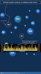
arctic_main-0acrtic_yohei_01

3. Reflections

All in all, I found this process to be very appropriate for quick ideation of design concepts that would fit into the 6wk window of opportunity that we had to start from scratch and deliver a functioning application. I’m proud to say that the “Arctic Questions” touchscreen application successfully launched on October 8th for the grand re-opening of the Arctic Exhibit at the Vancouver Aquarium.

I would be doing a disservice if I didn’t highlight the initiatives put in place by the Aquarium’s president John Nightingale and executed on by Jeff Heywood. The folks at the Vancouver Aquarium made a conscious choice to push the boundaries of traditional aquarium exhibit interactivity in hopes of creating an exhibit that utilizes new technologies to create an exhibit based around dynamic content generation and visitor interactivity. I feel quite fortunate to be a part of this shift and have high hopes for the future that other aquariums around the world will take notice of what’s going on at the Vancouver Aquarium and embrace interactive, technology-enabled exhibit designs of their own. Who knows, maybe we’ll find a way to connect them someday?

4. Resources

For those interested, you can watch a video interview that LiFT Studios put together highlighting various aspects of the project. They also developed an interactive application for the exhibit.

Video: Interaction Design at The Vancouver Aquarium

I’ve also posted design comps and photos/video updates on the progress of the application as we went through it » Flickr gallery for the project

The web version of the application is hosted here » Arctic Questions Website. It’s wired to the touchscreen application and the iPhone application that is being built as I write this entry.

Links:
» Follow Yohei’s blog
» Jeff Heywood on Twitter (@heywood)
» My ramblings on Twitter (@stony)

Posted in Interaction design, Nitobi, User Experience Design | 2 Comments » | Add to Delicious | Digg It

Speaking at “Entrance into the Industry: Design, Media Arts, and Informatics” | March 13th, 2009

At the close of Interaction’09 here in Vancouver I was surprisingly asked to come speak on a panel at Simon Fraser University’s School of Interactive Arts and Technology (SIAT). Stoked and humbled by the request I said “sure!” w/o first asking about what I would be speaking about. Turns out that I get to split my time talking about our local IxDA chapter and my perspective on being a User Experience Designer at an Agile SW Consultancy (Nitobi)

The panel event, Entrance into the Industry: Design, Media Arts, and Informatics, is being organized by the SFU TechBytes program that provides students in IAT and TECH courses with software & technical support to enhance learning needs across the SIAT curriculum.

Entrance into the Industry: Design, Media Arts, and Informatics

Posted in Agile, IxDA, User Experience Design | No Comments » | Add to Delicious | Digg It

iPhone Copy/Paste prototype | February 13th, 2009

By now we’ve all heard these words or uttered them ourselves, “why the hell didn’t they (Apple) build copy/paste into this damn thing!?” In an effort to improve on my idea + sketch + prototype process I threw together this little movie walking through a potential copy/paste solution for the iPhone OS.

Arguably and obviously there are many ways you could employ to trigger the copy/paste interaction. I chose the “3 finger tap” for this example. “Pressing” the screen for a set duration is another viable option that would trigger the copy/paste feature that came to mind, but I liked the “3 finger tap”. I’m sure there are tons of viable ways to launch the interaction and I’ve already had some questions about the ease of executing a “3 finger tap” as I put this together but the goal for me isn’t to be right, it’s to have the conversation. So here ya go! What’s your solution?

The movie


The initial sketch

iphone copy/paste sketch

Posted in Interaction design, User Experience Design | 4 Comments » | Add to Delicious | Digg It

Living in a cave can lead to good things | October 21st, 2008

While browsing through 90mobilesin90days I stumbled upon a wicked visual search browser and wondered to myself how I didn’t find this sooner? I can’t give enough praise for a job well done by the wizards at Viewzi. Having the power of being able to visually search via 18 facets/sites at your fingertips is just that… POWERFUL. The concept is forward thinking and I particularly love the appropriateness of interaction design in how they display the results across the various sites/facets. I definitely see myself using the site as a new point of potential inspiration for solving interaction problems as I encounter them. Cheers…

Posted in Information Architecture, Interaction design, User Experience Design | No Comments » | Add to Delicious | Digg It

Facebook takes a turn for the usable? | August 7th, 2008

With the new enhancements and layout changes to Facebook I figure it’s high time for me to take some time and get back to ye ol’ blog on UXD here at Nitobi

I must admit that upon a sub-surface evaluation of Layout, Navigation and Interaction Elements, I’m quite impressed with the changes to “The New Facebook”. I do have a few complaints but they’re far outnumbered by worthy improvements and advantages gained so here we go…

Global NAV

1. Removal of arrows for drop down menus

Perhaps they were just ready for a change but I can’t agree with the decision to remove a) the navigation functionality previously made available through the old nav and b) the visual cue suggesting to the user that there is more information hidden under the arrow should they click on it.


The look/feel is cleaner but I see several clear disadvantages:

  • removed the ability to select from multiple friend options in drop-down menu
  • removed the ability to navigate directly to specific “Inbox” options such as Notifications. If I’m not on the home page, how do I get to them?

I’m sure there is a reason behind this decision and it’s up for debate until one of you out there feels compelled to clear it up for me.

2. Addition of “Applications”

Seems like a logical addition but referencing the applications as “bookmarks” the “Status” container on the home page can be a bit unclear at first. Sure, I can easily figure out what they’re inferring with the icons but some a labeling change to “Application bookmarks” would clear this up greatly. With the previous observation negligible in scale, the major oversight here is that there’s no link in the Applications menu to “Find more applications”.

3. Changed “Profile” to “user.name”

Personally I liked it how it was before because it creeps me out a bit to see my name all over the place. I wonder what the meeting must have been like to justify that change?

Home Page

1. Layout

The first change I noticed was obvious in that they’ve increased the overall content container width to 964 pixels, a significant increase of 20% from the previous 799 pixel container.

This has gave them a nice advantage to condense the home landing page information vertically and in this case, contrary to my comparison of profile page footprints coming later, they actually increased my home page height, albeit by a negligible amount (134 pixels).

2. Visual changes

It’s nice to have the vertical bounding box removed. The content blocks now “float” in space and IMHO give the entire site a slightly lighter visual feel.

3. News Feed navigation

Having the newly added ability to browse through your News Feed by facet (Top Stories/Status Updates/Photos/Posted Items) is a welcome addition. This feature alone gives them arguably a 4x increase in information density by footprint w/o having to increase total page height. Nice work indeed in terms of IA and UX.

4. Inline Preferences/Editing for content chunks

I love this addition!! Incredibly useful and powerful for the user that will take advantage of it (of course).

. Wall: Edit posts
. News Feed: Set Preferences for a particular Friend being displayed
. Info, Apps, Friends all now have inline preferences found under the “Edit” box

AWESOME enhancement!! I love inline preferences. Incredibly useful.


Profile Page

1. Introduction of new profile navigation

Another addition that I am diggin’ on for various reasons. First and foremost by reworking this page and implementing a sub navigation they effectively reduced the height of my home page by 45.3%!!! (3487px » 1907px = 45.3% reduction in Eye Miles to view content). Those numbers are tough to argue with, especially in light of the fact that I now have more information at my disposal than before!

With the sub-nav now enabling inline viewing of Wall, Info, Photos and Boxes users, much like the new nav introduced on the home page for News Feeds, users can now browse 4x the info previously unavailable to access within the old layout. The best feature of this new profile navigation is the sub nav (Share Link - Add Photos - Give Gift - Fun Wall). I specifically like the Photos component that now allows users to create photo albums, post photos and take a photo directly within their profile page. IMHO this is one of the best small changes that they could have made in light of the fact that they have brought users one giant step closer to a core element of sharing experiences through social networking applications, PHOTOS!

Without going into every point in detail here’s my general list of advantages and disadvantages of the new profile navigation:

Advantage(s):
- Profile page is significantly shorter in height (3487px » 1907px = 45.3% reduction)
- Increased customization of profile view
- Greater IA priority and separation given to Photos
- New quick add interaction for creating albums/adding photos gets users that much closer to a core element of sharing experiences through social networking applications

Disavantage(s):
- Unnecessarily disruptive layout changes for navigating to Photos and Boxes.
- Photos page: No interaction element displayed for adding photos, only can Create and Album. They should consider including that interaction element as a component of the “Photos” sub nav which would help maintain the layout consistency and alleviate the disruptive layout change noted above.
The remaining items that I jotted down for the profile page alterations were….

- Wall and Mini Feed have been merged into one stream under “Wall”
- The additional tab in the profile NAV noting a “+” for adding a new tab to the mini-nav. I can infer that I’m able to add something via that interaction element but there’s no hover state indicating what it is until you select it. Small quirk, but easily addressed.

Summary

To sum things up I think the Facebook usability crew made some great decisions in the changes that they made to the new version. I’m quite interested to see how they address some of the dangling UI issues I have mentioned and any other once that surface over time as people make the switch. If you made it this far thanks for reading through my comments! Feel free to share yours or debate what I have to say.
Cheers, Chris.
Posted in Information Architecture, Social Networking Apps, User Experience Design | No Comments » | Add to Delicious | Digg It

Seattle coffee mogul launches “community ideas” website | March 25th, 2008

Under the banner of token moves to re-connect with customers, last week Starbucks launched a website (My Starbucks Idea dot com) to encourage fanatics to lobby for new directions that the coffee mogul should consider in an effort to convey topics ranging from product based ideas to social responsibility. The site design is pretty slick (of course) and generally usable. I signed up to give it a spin with particular interest in the interaction of discussion threads and to vote for the Joe that wants to see Starbucks to serve 100% fair trade product (can’t argue with that idea). I would like to see some top level thoughts from Starbucks for each catrgory, rather than just a silo for Social Responsibility. I’d like to know what that means to them as a company and thoughts they’ve put into it, for example.

Good effort on their part. I think we can all agree that they’re an easy target and it’s only a matter of time until gets polluted with bitching and ranting like every other general public community site but they’ve had some incredible traffic in just about a week of going live. It’ll be interesting to see how the moderation unfolds, if any at all.

Posted in Interaction, User Experience Design, social responsibility, usability | 2 Comments » | Add to Delicious | Digg It

Thoughts on the LinkedIn facelift | March 13th, 2008

To my surprise this morning I stumbled upon the new UI for LinkedIn. My first thought was “oh…. so this is what might happen as a result of putting Facebook and Flickr in a blender.” While it sure is slick in a “web2.0-ey” portal kinda way, I can’t get on the bus and agree that the new design is terribly usable.

Andre and I were briefly chatting about the font treatment in terms of it’s difficulty to distinguish content amongst the sea of blue. In the same respect, the content headers suffer the same fate and I’m really quite surprised that a third color wasn’t utilized in anticipation of the site being difficult to browse for content. Granted, the old UI wasn’t the best design in history but it sure was straightforward to use. The interaction implemented in the new left nav is nice as are the drag & drop organization of panels, but then again why can’t I overcome the “People You May Know” panel? Strange that a decision was made to “give me control, but not total control.”

The section headers are a bit of a question mark too. All of the top level content sections, Profile, Contacts, Inbox & Groups, have that familiar blue header treatment (where have I seen that recently?), yet the home page lacks the same treatment. C’mon guys!!

Kudos to the folks at LinkedIn for taking a leap of faith with the new UI but I would have expected a bit more from them in terms of UX design. AS I noted above, the new interaction elements are a nice addition, but I’d still like to see some changes. Please comment, tell me I’m crazy. I’d love to chat about it….

Posted in Interaction design, Nitobi, User Experience Design, usability | No Comments » | Add to Delicious | Digg It


Search Posts

You are currently browsing the archives for the User Experience Design category.

Archives

Categories