Starting back on August 20th we kicked off our first touchscreen project here @Nitobi. In this post it seemed to make sense to break this up by the Process we employed and the Insights gained along the way, with some supporting Assets dabbled in for good measure.
So, in the name of Process here goes…
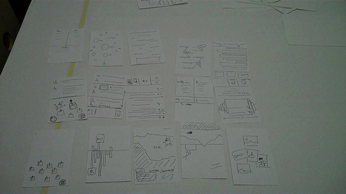
1. Paper Prototyping Workshop
It’s hard to put into words how excited I was to dig into this project and there was certainly a buzz around the office anticipating it’s start. Being my first touchscreen project my mind immediately started thinking “cool! now, where to start?”. Knowing the scale of the application it only made sense to me that we dive headlong into a paper prototyping workshop to get the juices flowing and have everyone involved from the beginning. That said, I put together a 3-4hr Paper Prototyping workshop with our client Jeff Heywood, Yohei (Nitobi Interaction Developer) and myself. The application is a commenting system for Aquarium visitors to ask questions or make comments about the Arctic and respond to existing questions/comments.
Supplies for the workshop included: 3×5 index cards, sharpies of many color, post-it notes, 5×8 index cards, scissors, MARS Drafting Dots, a roll of butcher paper, some simple pens for sketching and a fresh helping of warm caffeinated beverages.
I covered our boardroom table with white butcher paper so we could all embrace our inner child, drawing outside the lines w/o repercussion, and I also cut out a handful of full size versions of the 46″ monitor and taped them to the walls. After describing the context of the design challenge we were to consider I passed out (6) 3.5 index cards to everyone and set the timer to 60sec. The importance of this exercise is to essentially force us out of our comfort zone of pre-conceived design patterns that spring to mind and get to storming up some new ones. As I’ve observed in the 2 times experiencing this process, ideas 3-5 tend to be very interesting as that seems to be a regular point where our minds often run out of easy answers and start coming up with new ideas. NOTE: I can’t overstate the importance of communicating that it’s the process that’s more important than coming up with genius ideas. Everyone is equal in the workshop and there are no “wrong” ideas, just ones that are more appropriate than others given the constraints of the project.
6minutes = 6 Sketches
So here we go! Off and running with one sketch per minute. Love it. Remember… no wrong ideas, just sketch something! As I expected, we all came to a natural sticking point at rounds 3-4. No matter. Once we finished the 6 minute exercise we went around the room briefly explaining the meaning of each sketch with the opportunity for fellow participants to comment and/or ask questions. For cards that stirred up decent discussion I asked everyone to flip the card over and note a theme or some key words that emerged from the feedback.
Go Big!
We’re about 1hr in at this point after discussing all 6 rounds of cards (18 cards) and it was time for everyone to pick their concept that they wanted to GO BIG with on the full size interface prototype! Without moving to the full size interface we would essentially be trying to pick paint colors by holding paint chips up to your wall and envisioning the possibilities at a much larger scale (we all know how that goes). The importance of this step was to get an appropriate understanding of the scale that users will be interacting with at arms reach, attenuation from 30-40ft to draw users into the application and to get a feel for the possibilities of content arrangement. Yohei, Jeff and I all spent the next 2hrs or so drawing out the small sketches on the large sheets and using the 5×8 index cards to draw and cut out shapes for defining the interactions on the display. While this was happening I asked everyone to step back as far as possible from their designs and evaluate the concept under the given constraints and again talk through the idea with the group. We could do this because it was a small group.
Reflections
In spending roughly 4 hrs with our client we were able to give Jeff a glimpse into the thought process that we at Nitobi go through when brainstorming on design strategy and concepts. On more than a few occasions Jeff stood back and exclaimed “You know, at first I thought this was kinda weird and couldn’t see where you were going with it. Now I see the value in this process and where we’ve gotten to is great. And in such a short period of time.” Yohei, who was also skeptical of my plan, came out of the session wanting to do this for every project. I couldn’t agree more, when it’s appropriate. Here’s a video of the output from the session » Paper Prototyping Workshop
Next Steps
We (Nitobi) took the 3 concepts and mock up design prototypes for the application, with 3-4 interaction states and then presented them to our client on the touchscreen itself the following week.
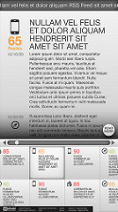
2. Design Prototyping
From a design and development perspective we had a tremendous advantage in being able to utilize the actual hardware at our office for roughly 4 weeks of the 6 week project. That said, Yohei and I got to work on fleshing out fairly high fidelity designs pertaining to the prototype concepts in order to get a feel for how the application “could” look based on each concept. This was important on several points. One being that we needed to mock up some of the basic interaction and interface views that we didn’t have time to address in the prototyping workshop. Another, being that the layout of our conference room doesn’t allow us to get more than 10ft from any wall so we needed to put some physical distance between us and the display to give it a healthy “squint test” and also get a good feel for how the app would look from a “fun” perspective.
Yohei and I both presented our design prototypes and, because it was on the actual touchscreen, we were able to run the presentation as a slide show that would naturally progress by tapping the screen. Brilliant! The goal of that meeting was to pick one design to move forward with, which we did successfully and placed the fate of the application in the trusty hands of Yohei to apply his combination of developer and designer magic to bring this application to life. Here’s a glimpse at the 2 themes…
3. Reflections
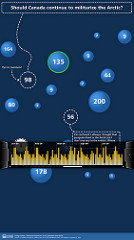
All in all, I found this process to be very appropriate for quick ideation of design concepts that would fit into the 6wk window of opportunity that we had to start from scratch and deliver a functioning application. I’m proud to say that the “Arctic Questions” touchscreen application successfully launched on October 8th for the grand re-opening of the Arctic Exhibit at the Vancouver Aquarium.
I would be doing a disservice if I didn’t highlight the initiatives put in place by the Aquarium’s president John Nightingale and executed on by Jeff Heywood. The folks at the Vancouver Aquarium made a conscious choice to push the boundaries of traditional aquarium exhibit interactivity in hopes of creating an exhibit that utilizes new technologies to create an exhibit based around dynamic content generation and visitor interactivity. I feel quite fortunate to be a part of this shift and have high hopes for the future that other aquariums around the world will take notice of what’s going on at the Vancouver Aquarium and embrace interactive, technology-enabled exhibit designs of their own. Who knows, maybe we’ll find a way to connect them someday?
4. Resources
For those interested, you can watch a video interview that LiFT Studios put together highlighting various aspects of the project. They also developed an interactive application for the exhibit.
Video: Interaction Design at The Vancouver Aquarium
I’ve also posted design comps and photos/video updates on the progress of the application as we went through it » Flickr gallery for the project
The web version of the application is hosted here » Arctic Questions Website. It’s wired to the touchscreen application and the iPhone application that is being built as I write this entry.
Links:
» Follow Yohei’s blog
» Jeff Heywood on Twitter (@heywood)
» My ramblings on Twitter (@stony)
