
Ask.com gets 20% more usable by going vertical 
June 8th, 2007
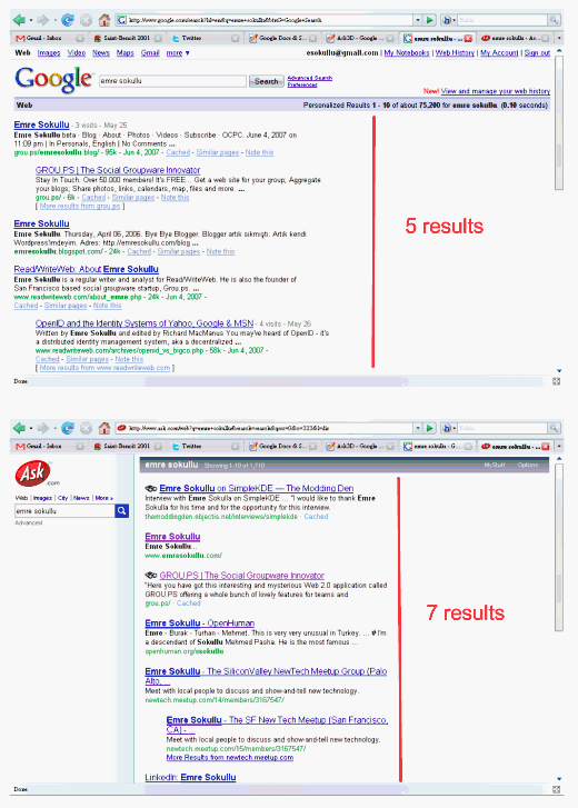
Emre over at the Read/WriteWeb claims that the “New Ask.com UI Gives 20%+ More User Satisfaction”
I like this line of thinking! The basic premise is that a better use of vertical space for the search listings allows more search results to displayed above the fold than . This makes sense is intuitive. I guess you’d have to also take into account how often the those lower links are actually clicked and how relevant those links are (did the user find what they were looking for??). But putting user experience and usability into numbers is always hard. You could tack how much scrolling goes and how often the lower listings are read. This could be done with analytics, eyetracking or mouse tracking.
I think Emry’s post does a great job of explaining the thinking that went into this UI update. Worth noting this not Ajax, RIA or throwing technology at a problem. It’s just good design thinking from Ask, IMO.
Emry also ties is past eye tracking research and the well know “F” eye gaze pattern. Worth a read.
What do you think?
Technorati Tags: usability, ask, google, ux, measure, stats, design, userexperience, internet, web
|  Del.icio.us
This entry was posted on Friday, June 8th, 2007 at 6:59 pm and is filed under Technology, Software Development, Usability – HCI. You can follow any responses to this entry through the RSS 2.0 feed. You can leave a response, or trackback from your own site.
 Entries (RSS)
and
Entries (RSS)
and